An interior entry for a specialized medical practice needs to do something a home entry doesn't, put people at ease the moment they walk up to it. St. John's Breast Center needed a door that read as warm and reassuring rather than clinical, while still handling the practical needs of a commercial healthcare space: privacy for patients, durability for constant daily traffic, and a place to feature the practice's identity right at the entrance.
Project Story
The thinking behind the work
The Starting Point
The Thinking
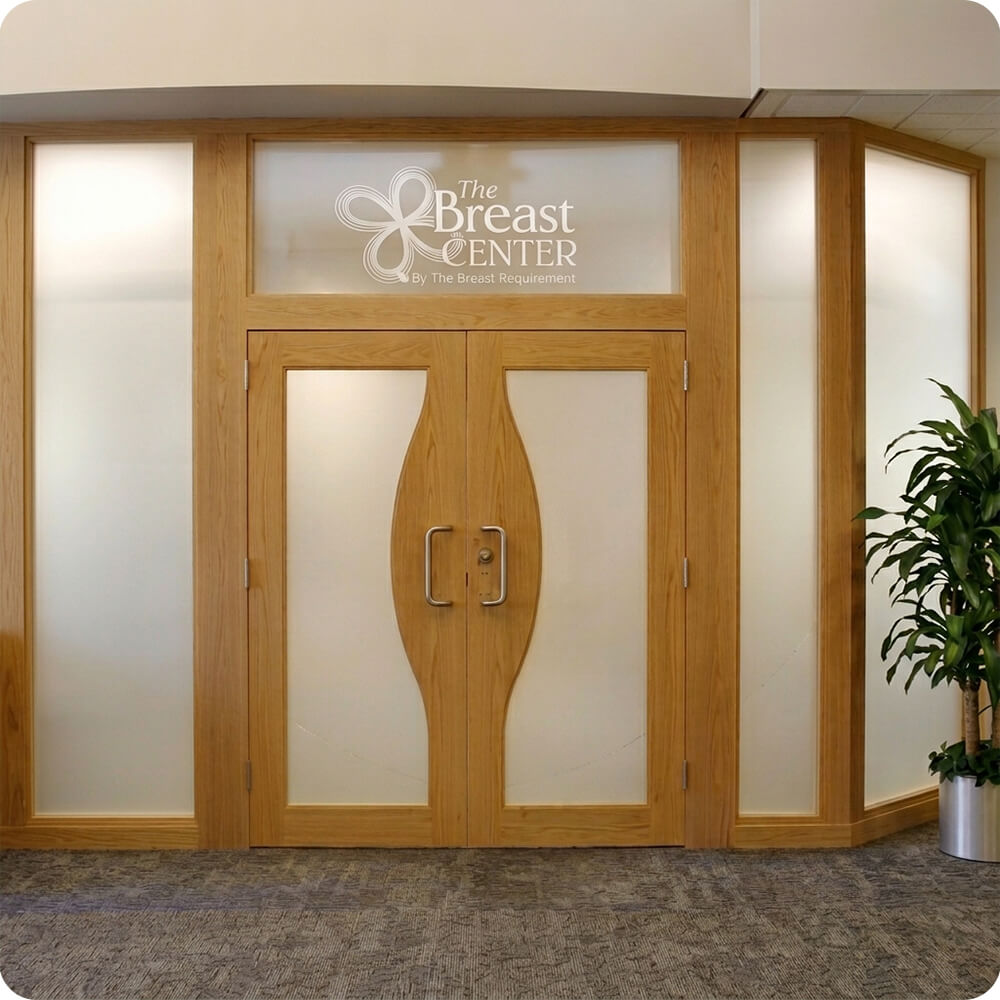
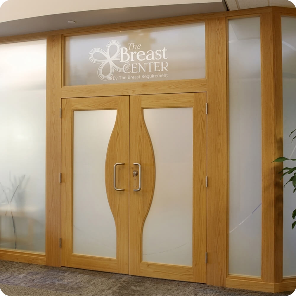
The design centers on a distinctive lens-shaped double door profile — each leaf curves inward to a point at the vertical center rather than meeting as two straight rectangular panels, giving the entry a soft, organic silhouette instead of a hard institutional line. Frosted glass fills the upper portion of both leaves and continues into the flanking sidelights and transom, letting daylight and interior light pass through while keeping the space private, exactly what a healthcare waiting area needs.
The Execution
Built as a double interior door with a lens-shaped leaf profile, each door leaf glazed in frosted glass across the upper half above a solid lower panel. Matching frosted glass sidelights and a transom flank and top the doors, with the practice's name and logo sandblasted or etched directly into the transom glass. Finished in a light, warm wood tone that reads as approachable rather than formal. Hardware is a pair of polished chrome pull handles, mounted at the door's widest point for a clean, symmetrical grip.
The Result
The entry does real work for a healthcare practice, it signals the space clearly from a distance through the etched glass branding, keeps the interior private without feeling closed off, and greets patients with a warm, calming material palette instead of a cold commercial storefront look.
Specification
Unit Size
6'-6" x 8'-0"
Panel Thickness
1¾"
Joinery
Mortise-and-tenon, no mechanical fasteners.
Glass
Frosted/etched privacy glass throughout doors, sidelights, and transom, with the practice's logo etched into the transom glass
Finish System
Interior-grade clear or light stain finish, light honey tone
Hardware
Polished chrome pull handles
Installed By
Scobis
Common Questions
Why use a curved, lens-shaped door profile instead of standard rectangular panels?
A healthcare entry benefits from feeling less clinical and institutional than a typical commercial door. The soft, curved silhouette of each leaf gives the entry a more organic, calming shape, setting a different tone than a hard-edged rectangular door would for patients arriving at a sensitive medical appointment.
Why frosted glass instead of clear glass for an interior entry?
Privacy matters in a waiting area, especially for a specialized practice like a breast center. Frosted glass lets daylight and interior light pass through the doors, sidelights, and transom, keeping the space feeling open and bright without patients being visible from the hallway.
Why etch the practice's logo into the transom glass instead of using a separate sign?
Building the branding directly into the glass keeps the entry clean and integrated rather than adding a bolted-on sign that can look like an afterthought. It also means the practice's identity is visible from a distance, helping with wayfinding in a larger medical building.
More Projects Like This