
The 5 Wood and Color Pairings That Make a Home Feel Expensive
I’ll tell you a secret from years of walking into beautiful homes. The ones that feel expensive rarely got there through pricey furniture. They got there through the relationship between the wood and the color around it. Picture a walnut sideboard glowing against olive walls, or white oak sitting next to soft sage cabinetry. When wood and color share the right undertones, the room feels intentional, calm, and custom. When they clash, even the most beautiful materials can look cheap. So here are some wood and color pairings that you can choose for your home.
The question we hear most isn’t “Which wood is best?” It’s “What goes with it?” I love that question. Learn why each one works, the wood species I’d choose for it, the millwork that brings it to life, and a few tips from the shop that most people never hear.
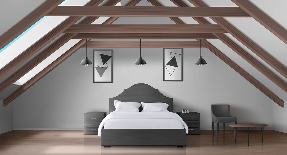
Why do certain wood and color combinations look so high-end?
Every wood has an undertone. White oak leans yellow-green, walnut leans red-brown, and cherry and honey-stained oak lean orange. Paint colors have undertones too, and this is where the magic, or the trouble, happens.
Rooms that look expensive follow one of two rules. The wall color either echoes the wood’s undertone, like terracotta with honey-toned wood, or it sits opposite that undertone on the color wheel and balances it, like olive green against red-brown walnut. What these rooms avoid is the near miss. A cool blue-gray next to orange oak makes the wood look brassy and the gray look dingy, and no amount of styling fixes it.
The second secret is what we call the neutral bridge. Every palette below combines one color, one wood, and one quiet neutral that ties them together. That third tone is what keeps a bold color from feeling overdone.
The third is texture. Matte, textured walls such as limewash, plaster, or a low-sheen paint let the wood grain take center stage. High gloss competes with it, and the wood should always win.
Sage, Beige, and Natural Oak
The best pairing for a warm, modern kitchen. Sage and oak are a match we never get tired of. Sage’s gray undertone cools oak’s natural yellow without fighting it, and beige, whether in a plaster range hood, a backsplash, or a stone countertop, bridges the two. The result feels soft and cohesive instead of two-toned.
Best wood: White oak, rift-sawn or quartersawn, with a clear matte or natural finish. Rift-sawn oak has a straight, quiet grain that looks tailored. We steer clients away from amber finishes here, because they push oak toward orange and fight the green.
Millwork that elevates the room: Paint the perimeter cabinetry sage and build the island in natural oak so it becomes the heart of the kitchen. Oak floating shelves with integrated lighting carry the wood across the room, and a plaster or beige hood breaks up the run of cabinets. Finish with warm hardware in aged brass or bronze.

Olive, Walnut, and Ivory
This is how to create a rich, moody dining room. If we had to pick a favorite, this might be it. It’s the most sophisticated pairing on the list. Walnut’s red-brown undertone sits nearly opposite green on the color wheel, so each one makes the other look richer. Ivory on the ceiling, drapery, or artwork keeps all that depth from feeling heavy.
Best wood: American black walnut in an oil or low-sheen finish that lets you see into the grain. Walnut is naturally dark and doesn’t need stain, and stained look-alikes never quite match its richness.
Millwork that elevates the room: A walnut built-in buffet or sideboard wall, walnut wainscoting to chair-rail height with olive above, or walnut pocket doors between the dining room and living room. This palette is at its best in rooms you use in the evening under warm light: dining rooms, libraries, and home offices.

Terracotta, Mustard Wood, and Brown
The pairing that rescues golden oak. Terracotta and golden, honey-toned wood come from the same warm family, and together they create a room that wraps around you, a little Mediterranean and completely cozy. Deep brown in leather, dark ceramics, or a darker stained piece grounds the whole palette.
This one is close to my heart, because it’s such good news for homeowners with honey oak trim. So many people think the only answer is to paint it white or cover it with gray. Please don’t. Lean into it. Terracotta makes golden oak look like it was chosen on purpose.
Best wood: Oak with a honey or golden stain, teak, or cherry, which deepens to a beautiful warm red-brown over the years.
Millwork that elevates the room: Arched niches with built-in shelving and concealed LED lighting, floating wood shelves, and a long, low media console. Arches soften the room’s lines and feel completely at home in this earthy palette.

Palo de Rosa, Sand, and Taupe
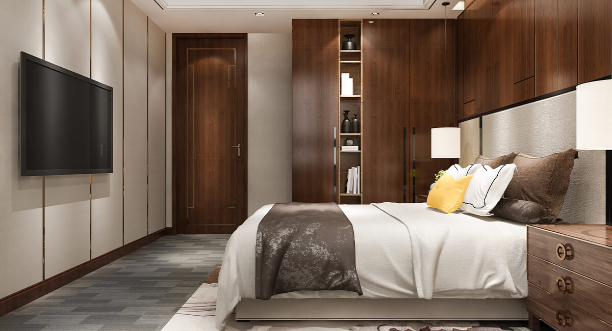
The Softest Palette for a Restful Bedroom. Palo de rosa, a dusty, muted rose, is pink all grown up. The gray and brown in its undertone keep it from ever feeling sweet. Sand and taupe carry the same soft warmth, so the room reads as one gentle gradient, and walking into it feels like exhaling. It’s perfect for bedrooms and dressing rooms.
Best wood: Light, fine-grained species such as maple, ash, or white oak in a natural or lightly whitewashed matte finish. Keep the wood pale so it supports the palette; dark wood breaks the spell.
Millwork that elevates the room: A full-width paneled headboard wall with an integrated lighting ledge, built-in floating nightstands, and picture-frame molding painted in the same color as the walls. That tone-on-tone color drenching makes the room feel custom without adding contrast.

Greige, Charcoal, and Ivory
This is how to design a spa-like primary bathroom. This is the most tailored palette of the five, and it’s the one I recommend when a client says, “I want it to feel like a hotel.” Greige walls and stone keep the room warm, charcoal cabinetry adds contrast and weight, and ivory in the tub, counters, and lighting keeps everything bright. Warm metals and one natural wood element stop the charcoal from ever feeling cold.
Best wood: Charcoal-stained or ebonized white oak for the vanity, rather than paint. The grain shows through the dark color, and it wears far better over time than painted cabinetry. Then add one natural walnut or oak accent, such as a stool, shelf, or mirror frame, for warmth.
Millwork that elevates the room: A floating vanity with toe-kick lighting, recessed shower niches, and framed or arched mirrors. In a bathroom, always use a moisture-rated finish and seal the wood on all six sides.

How to bring these pairings into your millwork?
Choose the wood first, then the paint. Paint can change in a weekend; a wood species can’t be swapped once it’s built. Always test your paint next to the actual wood with its actual finish, never against a tiny chip or a photo on your phone.
Give each material a job. Let color carry the walls or painted cabinetry, let wood carry one or two focal pieces, and let the neutral fill in the rest. Warm LEDs between 2700K and 3000K will bring out the undertones every one of these palettes depends on.
Planning custom doors?
If you’re planning custom doors, trim, or built-ins in St. Louis, we’d love to help you find the right wood, finish, and palette for your home.
Choosing wood and color pairings for St. Louis homes
One of the things we love most about working in St. Louis is the housing stock. From brick bungalows in Kirkwood and Webster Groves to grand homes in the Central West End, University City, and Ladue, so many still have their original stained trim, built-ins, and pocket doors.
These palettes feel like they were made for them: olive and walnut in a Central West End dining room, terracotta against original golden oak in a Kirkwood bungalow, or sage and white oak in a Clayton kitchen renovation.
The climate matters too. Humid St. Louis summers and dry, heated winters make wood expand and contract all year long. For custom millwork, and especially exterior doors, choose stable cuts like quartersawn or rift-sawn lumber, let the wood acclimate before installation, and finish every surface, including the edges no one will ever see. That’s how a piece still looks beautiful twenty years from now.
FAQs: Wood and color pairings
What paint colors go best with oak trim?
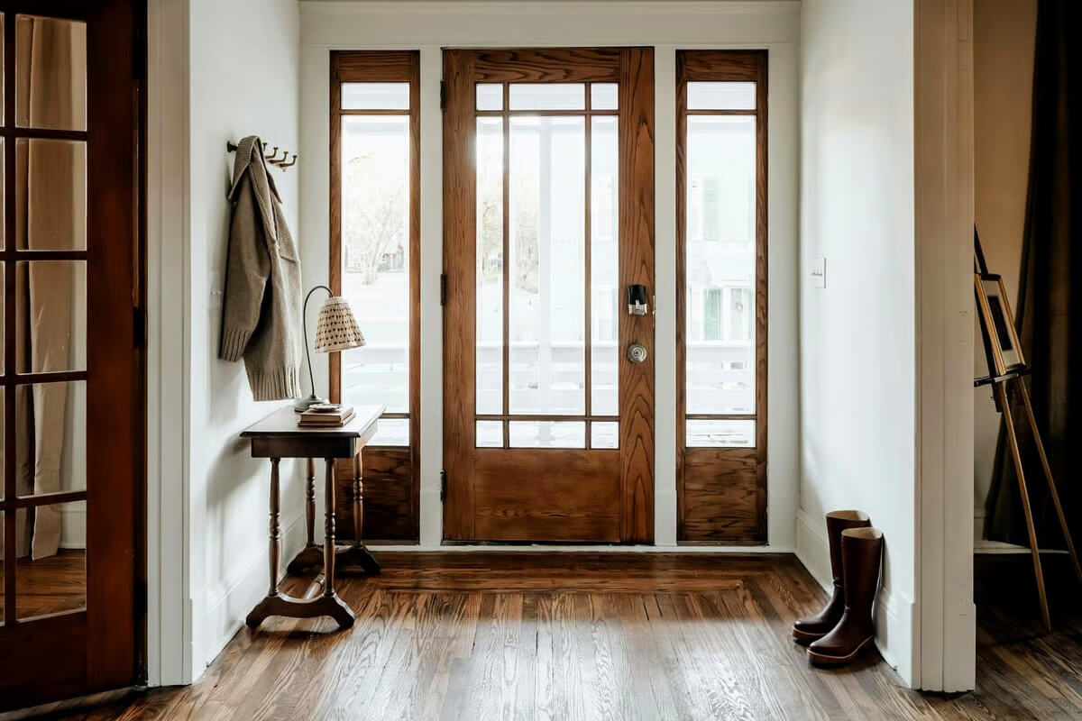
It all comes down to the oak’s undertone. Honey or orange-toned oak looks best with terracotta, olive, and warm whites. Natural white oak looks best with sage, beige, and greige. With either one, skip the cool blue-grays.
Should wood trim and wood floors match?
No, and please don’t try to match them exactly. Aim for coordinating undertones and a few shades of contrast. An almost-match looks like a mistake; a clear contrast looks like a choice.
Is walnut or white oak better for custom millwork?
Both are wonderful, just for different jobs. White oak is harder, more stable, and takes stain beautifully, so it’s ideal for hardworking cabinetry and doors. Walnut is naturally rich and dark, which makes it my go-to for focal pieces like built-ins, sideboards, and statement doors.
Should I paint my stained wood trim?
Try changing the wall color first. The right color often makes existing wood look intentional again, and painted trim is very hard to undo. A lovely middle ground is painting the trim and keeping the doors in stained wood.
Which wood and color pairing is the most timeless?
Our seasonal swings make wood expand and contract, which can lead to sticking, gaps, or cracked finishes over time. Stable species, quartersawn or rift-sawn cuts, and finish on all six sides help a door hold up for decades.
How does St. Louis humidity affect custom wood doors?
Contact Our Team!