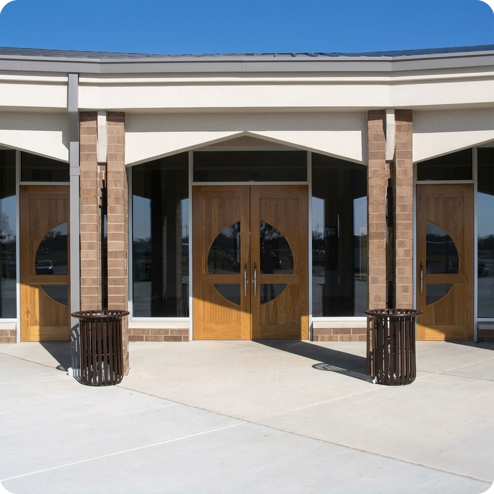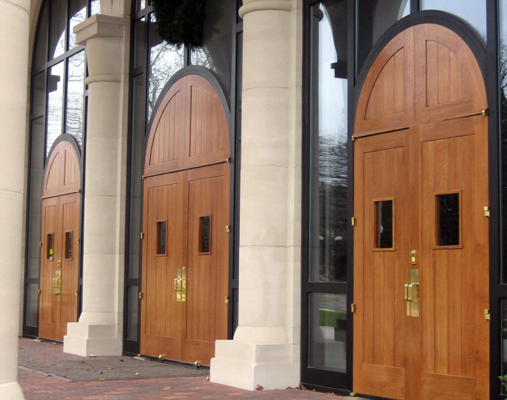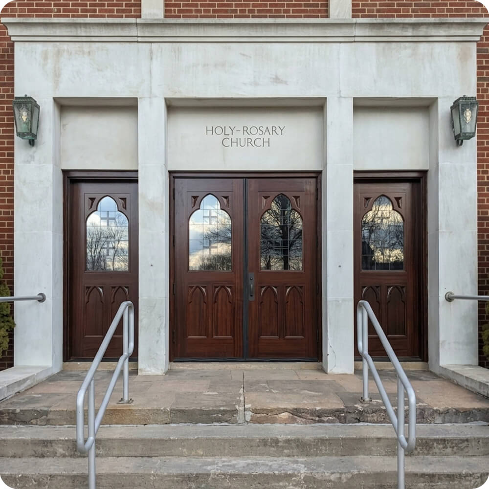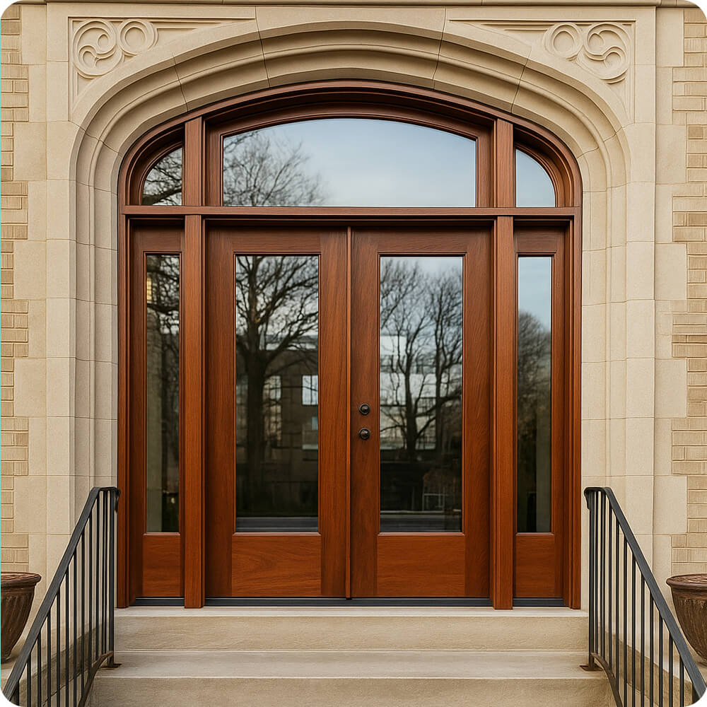
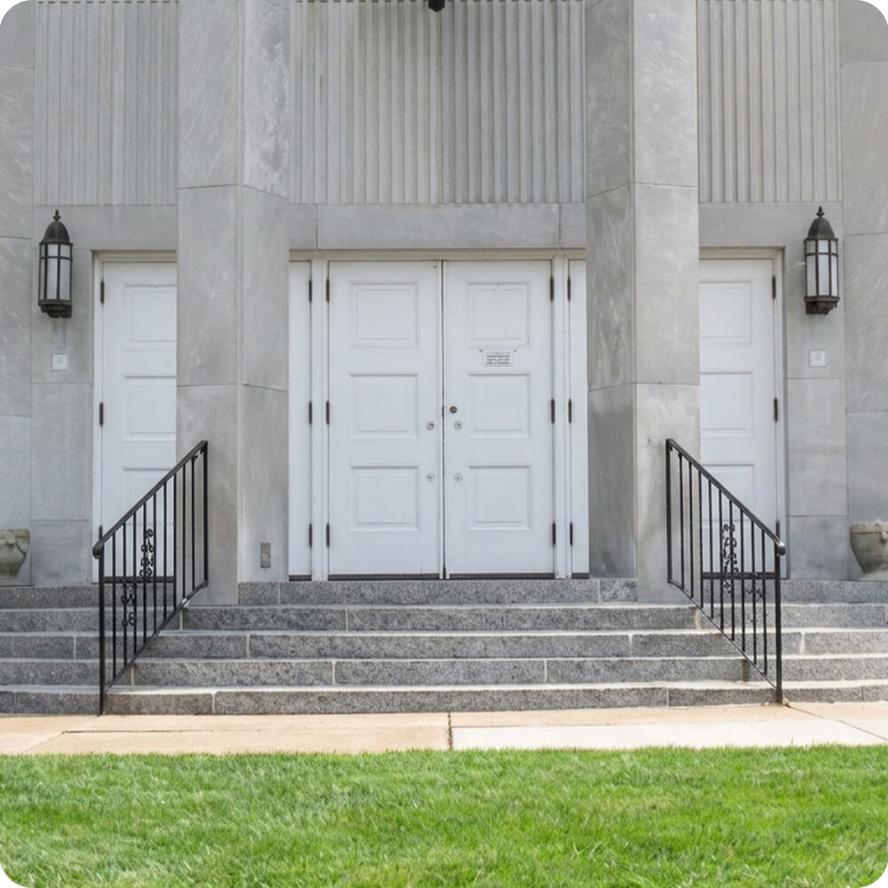
The church's original entry was a set of plain white flat-panel doors, no glass, no distinguishing detail, split across separate side-by-side units. Handwritten and printed signs taped to the doors told visitors to go to the rectory for access or to use a specific center door, a clear sign the entry wasn't functioning well as a welcoming, legible entrance. The doors themselves gave no visual cue about which was the actual way in.
Project Story
The thinking behind the work
The Starting Point
The Thinking
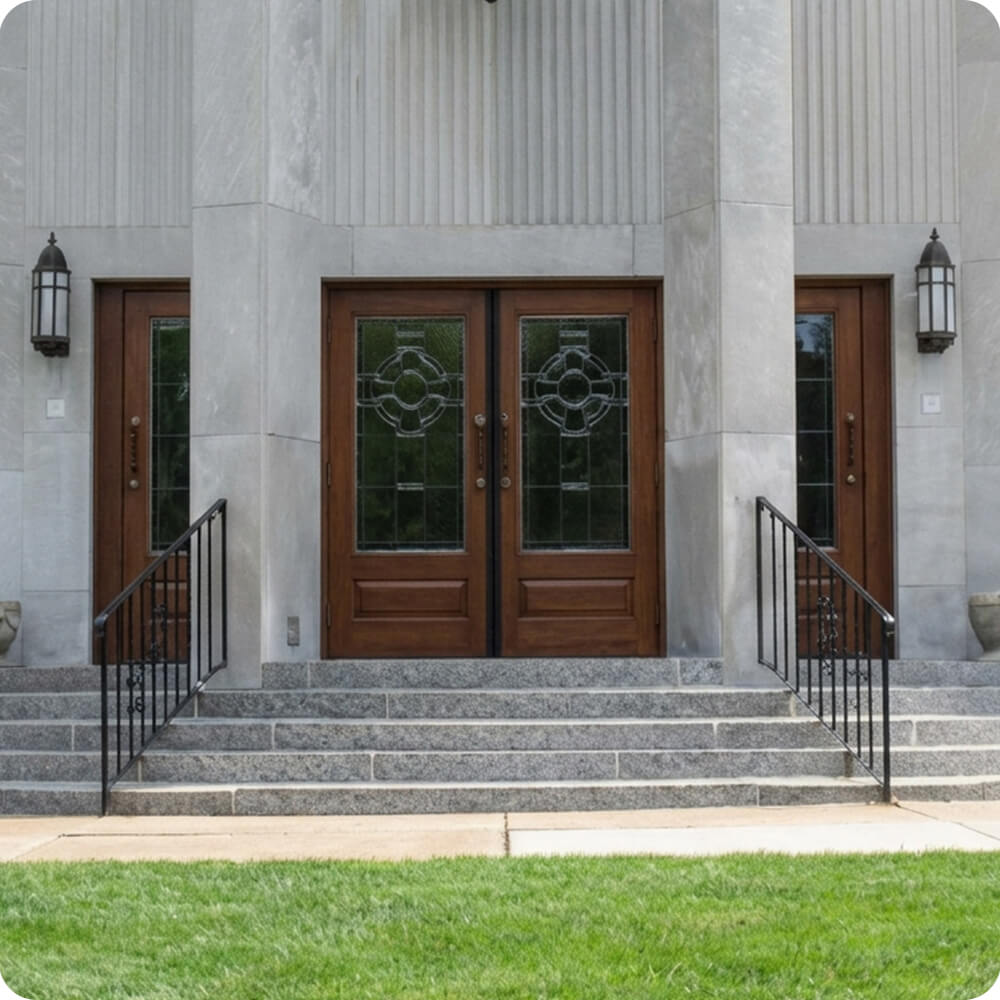
With three separate door units spread across one stone facade, the goal was to make them read as one coordinated, functioning entrance rather than a row of confusing, unmarked options. Real oak with leaded glass replaced the featureless white panels, bringing genuine daylight and craftsmanship to every opening. Each door leaf carries its own distinct leaded-glass medallion pattern, one leaning toward a circular motif, others more diamond and lattice-based, so the doors relate to each other as a family without being identical stamped copies.
The Execution
Built as a matched set across three door units, a single door on each end and a double door at the center, all in stained oak with leaded glass lites in the upper two-thirds of each leaf, sitting above one solid raised panel at the base. Each leaf carries its own distinct leaded-glass pattern rather than an identical repeated design. Finished in a warm, medium-brown oak stain. Hardware is substantial brass pull bars with decorative rosette end plates, mounted at hand height on every leaf.
The Result
What was a confusing set of unmarked white doors, requiring posted signs to direct visitors to the right entrance, is now a clearly legible, inviting entry, real wood, real glass, and consistent brass hardware across all three door units make it obvious where to go without needing a sign to explain it.
Specification
Unit Size
Double Door: 6'-0" x 7'-6" | Single Door: 3'-0" x 7'-6"
Panel Thickness
2¼"
Joinery
Mortise-and-tenon, no mechanical fasteners.
Glass
Leaded glass, distinct geometric medallion pattern per leaf, upper two-thirds of each door
Finish System
Marine-grade exterior finish, six sides, natural golden-oak stain
Hardware
Brass pull bars with decorative rosette end plates
Installed By
Scobis
Common Questions
Why did the original entry need signs telling people where to go?
The original white flat-panel doors gave no visual distinction between the working entrances and any locked or secondary doors, so signs had to compensate for what the doors themselves couldn't communicate. A more legible, intentional design lets the doors do that work visually instead.
Why give each door leaf a different leaded-glass pattern instead of one repeated design?
With multiple door units across one facade, using slightly different patterns on each leaf keeps the entrance from feeling like stamped, identical copies while still relating to each other as one coordinated family through shared material, stain, and hardware.
Why brass hardware with rosette plates instead of simpler modern pulls?
Substantial brass hardware with a decorative rosette plate matches the traditional character of leaded glass and stone architecture better than a minimal modern handle would. It also gives every door consistent, easy-to-spot hardware, reinforcing which doors are the actual entry points.
More Projects Like This